

Helping new instructional designers choose colors with confidence

Color Scheme Picker an xAPI-Enabled Tool
My role: Instructional Design, Product Design, xAPI Implementation
Tools: Articulate Storyline 360, Adobe Creative Suite, xAPI, JavaScript, Veracity LRS, Tabaleu, & Lovable
Results:
7,000+ designers initiated the tool
1,425 viewed Orchid Example Color Scheme
918 favorited Orchid as their favorite color scheme
Top three color schemes: Orchid, Teracotta, and Sea Serene
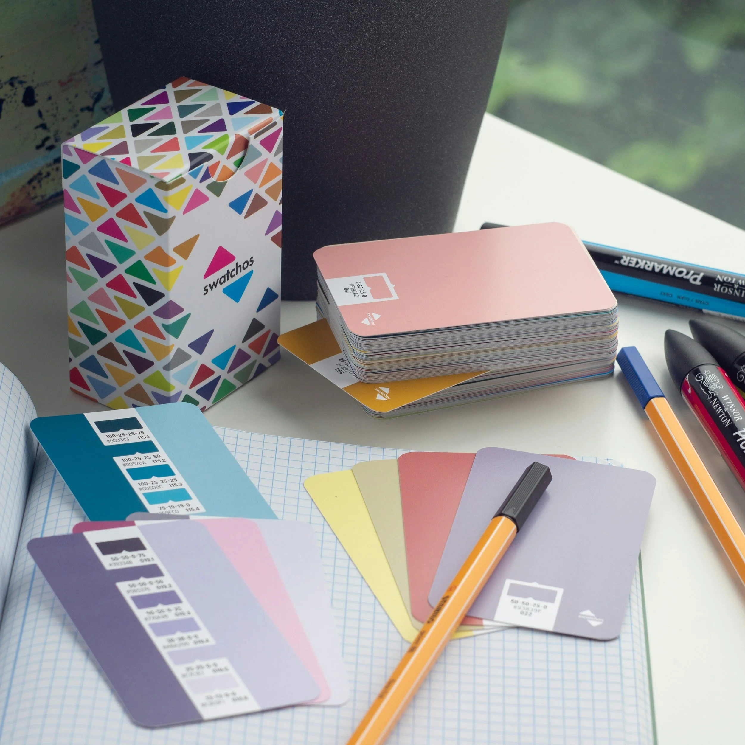
Image credit Andy Brown Unsplash
For new instructional designers, choosing colors is paralyzing. You know color matters.
You've read that the wrong palette can increase cognitive load, distract learners, or undermine credibility. But you're staring at a blank slide in Articulate Storyline, and the color picker offers 16 million options. Which blue conveys trust without feeling corporate? Is this orange energizing or overwhelming? Does this green work for a healthcare module, or does it feel too... clinical?
After interviewing instructional designers new to graphic design, I heard the same confession repeatedly: "I spend hours agonizing over colors — and I'm still not confident in my choices." They didn't need more color theory. They needed a starting point they could trust.
"Aleksandra's color picker was a game-changer for me. It made the process of selecting cohesive and professional color schemes so much easier, and I used it to create the palette for one of my instructional design projects. It can be overwhelming picking a color scheme for a project, but Aleksandra's tool simplified everything. I especially appreciated the inclusion of hex codes and the featured image displaying all the colors together—it really helped me visualize how the colors would work in harmony."
Mary Beth Allgaier - Educator
The insight: Designers don't want infinite choice, they want curated confidence. When I dug deeper, I discovered that new designers weren't looking for creative freedom. They were looking for permission to use colors that work.
They wanted someone with design expertise to say: "This palette is appropriate for finance. This one works for healthcare. Here's what each conveys."
The problem wasn't a lack of tools; it was a lack of context. Color generators offered endless combinations, but they didn't explain why certain colors belonged together or when to use them.
I decided to build a tool that did three things:
Curate industry-appropriate color schemes
Explain the mood and use case for each
Make it effortless to copy and use them


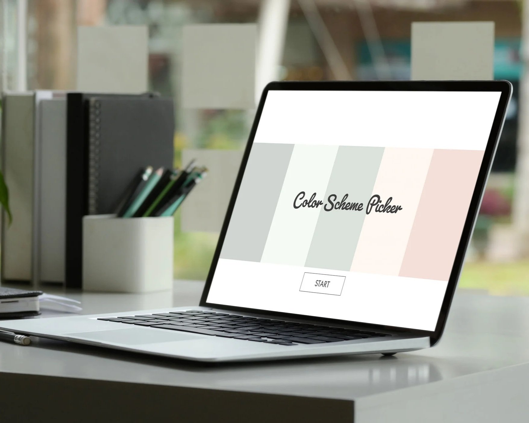
I started with wireframes in my notebook, the same way I've brainstormed since art school. My goal was minimalism with function.
I studied popular color tools like Coolors and Adobe Color, noting what worked and what overwhelmed users. Then I sketched interfaces that prioritized clarity over features.
The core interaction needed to be simple: Browse. Favorite. Copy. Use. No account creation. No complex filters.
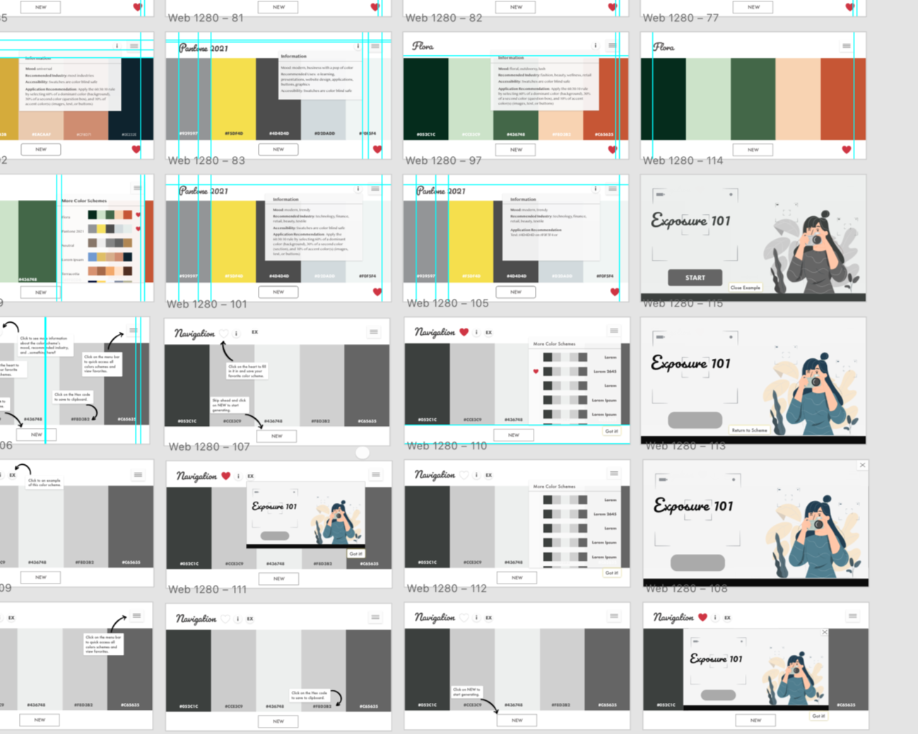
Just ten carefully chosen palettes that covered the industry's instructional designers’ work in most: healthcare, finance, tech, education, retail, and hospitality.

The navigation tutorial became a design challenge I loved solving.
How do you teach someone to use a tool without making them feel like they need instructions? I built a step-by-step walkthrough that users could complete or skip, but here's the twist: if they chose to go through it, I locked the steps to prevent confusion.
Each step revealed one feature at a time; no information overload. No ambiguity. And at the end, they could confidently explore on their own. The entire tutorial lives on a single slide, built entirely with states, triggers, and variables. It was the most technically complex part of the project, and the most rewarding when it finally worked seamlessly.
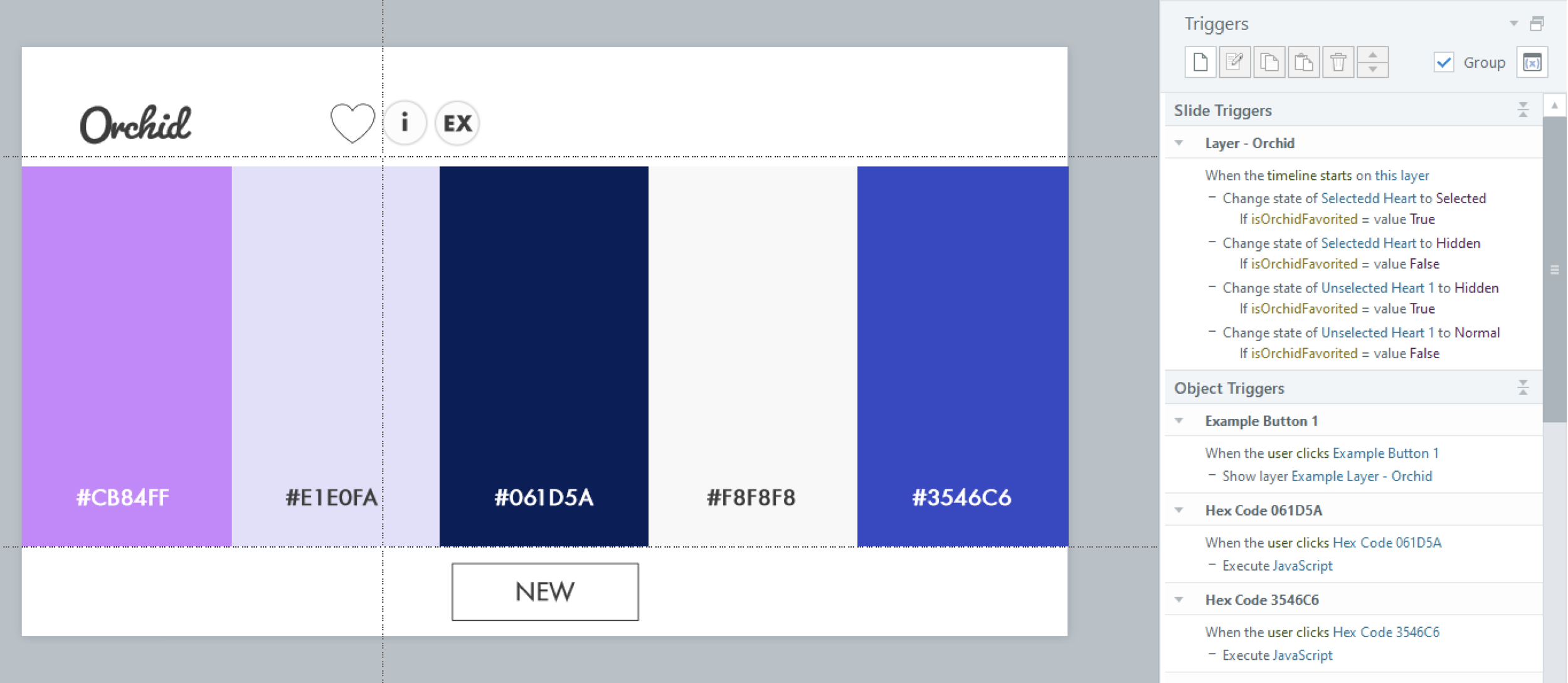
Small details create an emotional connection.
I added a heart to show favorited schemes. When a user “favorites” a color scheme, a heart appears. It's a tiny interaction, but it matters. Hearts are universal; we understand that clicking one means "I like this" or "Save this for later." I also made sure the heart persisted in the dropdown menu, so users could see at a glance which schemes they'd favorited. This small touch transformed the tool from functional to personal.
I included visual examples because designers think in context, not abstraction.
Each color scheme comes with an eLearning mockup showing the palette in use. Designers could see exactly how the colors worked together on a slide, not just as swatches, but applied to headings, buttons, backgrounds, and accents. This answered the unspoken question: "But what will it actually look like in my course?"

I wanted to understand how people actually used the tool — so I built in xAPI tracking.
Every interaction sends data to a Learning Record Store:
• Did they go through the tutorial or skip it?
• Which color schemes did they favorite?
• Which hex codes did they copy?
• Did they view the industry descriptions or jump straight to copying colors?
This wasn't surveillance; it was curiosity. I wanted to know if my design assumptions were right. I meticulously wrote down notes and checked boxes off as I added each line of code into Articulate Storyline 360. Testing the JavaScript was essential in ensuring that it would execute and send a statement to the LRS.

The data revealed surprising patterns about how designers make decisions.
Half of the users skipped the tutorial. They wanted to explore immediately, which told me the interface was intuitive enough that instructions felt optional. 83% favorited at least one scheme. This validated that curated options resonated more than an overwhelming choice.
Orchid, Terracotta, and Sea Serene were the most copied schemes. Though each palette had cheeky names, this still confirmed my hypothesis about which industries instructional designers work in most often. Users who viewed examples were 2x more likely to copy hex codes. Seeing the colors in context gave them confidence to use them.
The data also revealed where I could improve: very few users clicked the information button explaining the mood and industry. Either the descriptions weren't needed, or the button wasn't prominent enough. Future iterations could test this.
Testing. Testing.
Testing on real devices revealed issues I'd never catch in preview mode. When users tested the tool on mobile and tablets, the information boxes wouldn't hide properly.
They'd stay visible even after clicking away — breaking the experience. The fix required converting states to layers and adjusting triggers. It was tedious, but essential.
A tool that doesn't work on mobile isn't a tool designers will use. This quality assurance process taught me that what works in a desktop preview doesn't always work in real-world use. Testing with actual users on their devices is non-negotiable.
The feedback confirmed the tool solved a real problem.
"It made the process of selecting cohesive and professional color schemes so much easier."
— Mary Beth Allgaier, Educator
"I felt a lot more confident during the design process and really excited with the results!"
— Gabriela Rodrigues, Organizational Development Manager
“The Color Scheme Picker is an empowering tool, enabling designers to choose excellent color schemes."
— Min Tang, Director of Product Management
Designers weren't just using the tool; they were feeling confident in their choices. That was the goal all along.
The result? Over 7,000 designers stopped agonizing over colors and visited the widget.
By curating choices instead of expanding them, I removed decision paralysis. By showing examples in context, I gave designers confidence. And by tracking behavior, I learned what actually matters to users, not what I assumed mattered. This project taught me that good tools don't give users everything; they give users exactly what they need, when they need it.
Building the Color Scheme Picker challenged me to think like a product designer, not just an instructional designer.
I had to consider not just what users needed to learn, but how they'd actually use the tool in their workflow. This meant prioritizing speed and simplicity over comprehensiveness. It meant designing for confidence, not perfection.
The xAPI implementation pushed me technically. Writing custom JavaScript, troubleshooting when statements didn't fire, and analyzing data to validate design decisions, these skills expanded my capabilities far beyond traditional eLearning development.
But the most rewarding part was hearing from designers who said the tool changed how they approached their work. Color is no longer a source of anxiety for them; it's a tool they wield with confidence. That's what good design does: it removes barriers and empowers people to focus on what matters most.
What’s next? Good design is never finished; it evolves with the people who use it.
The original Color Scheme Picker taught me how designers make color decisions. Now I'm exploring how AI tools can accelerate the design process itself. I've been experimenting with vibe coding and Lovable to build faster, test ideas quicker, and push my technical boundaries.
The result? An MVP2 of the Color Scheme Picker that explores new interaction patterns and workflows. It's a work in progress, but that's the point. Learning happens when you ship, iterate, and respond to real feedback. Want to see the result? I recorded a quick demo. Let me know your thoughts!