

xAPI Dashboard Exploration with AI-driven Analytics
When AI-driven analytics reveal unexpected insights
Project Context: An exploration in leveraging Claude AI to analyze xAPI data from my Customer Service Recovery portfolio project, revealing how context shapes data interpretation, and what four years of behavioral data can actually tell you or not.
My role: Learning Experience Designer, Learning Analytics Explorer
Tools used: Veracity LRS, Claude (Sonnet 4.5), Python (Pandas), React, Recharts, CSV Export
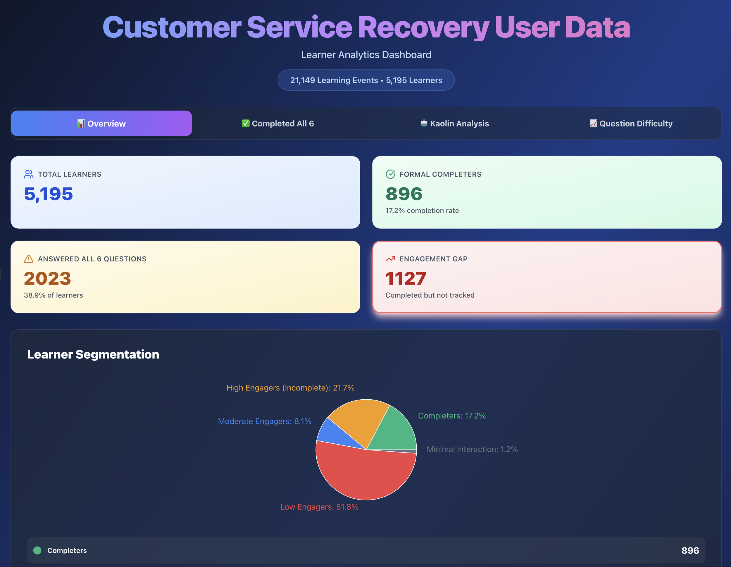
Key insight: 2,023 of 5,211 visitors (39%) completed all six questions, proving the value of scenario-based learning even in a portfolio context.
I already had the data. I wanted to see what AI could do with it.
I'd been collecting xAPI data from my Customer Service Recovery project since it launched: every question attempt, every Kaolin mentor interaction, every completion event. Veracity LRS does a solid job of surfacing its own built-in analytics, and I'd seen what that looked like. But I wanted to go further.
I wanted to explore whether Claude AI could help me create richer data visualizations and analytical insights than what a standard LRS dashboard provides, and whether there were efficiency gains in using conversational AI to interpret behavioral data rather than building out reports manually: a new tool, a different lens, and a chance to see what was possible.
What I found wasn't just about the data.
The first analysis: when AI assumes the wrong context
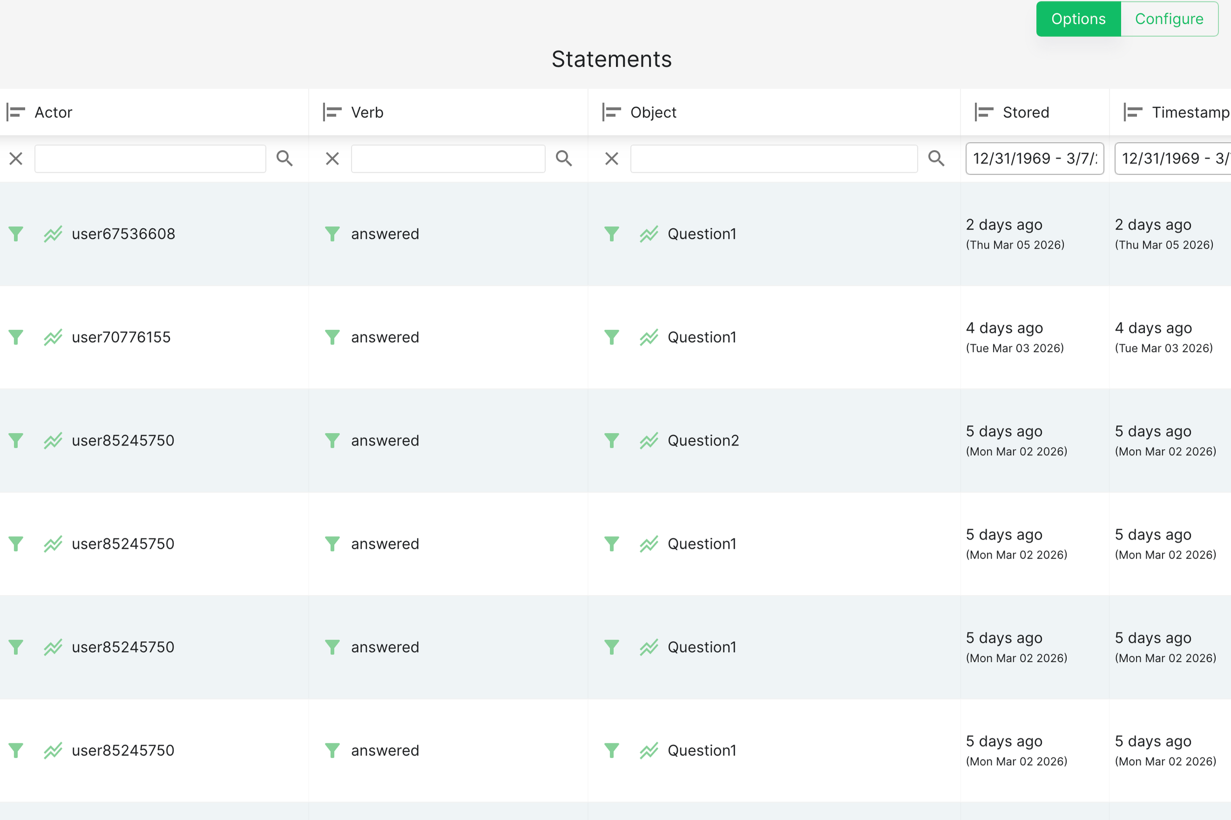
I started by exporting my raw xAPI data from the LRS and asking Claude to flag anything that needed cleaning. It surfaced 786 duplicate records. After working through the data more carefully, I removed 595 of them (actual errors) and kept 191 (legitimate repeated help-seeking behavior from learners returning to Kaolin multiple times).
That distinction mattered. Removing all of them would have been technically tidy and analytically wrong.
With the cleaned dataset, I asked Claude to analyze completion rates and engagement patterns. The result looked like a learning crisis:
Only 901 of 5,211 learners (17.3%) completed with certificates
Severe engagement drop-off after Questions 1 and 2
Kaolin help in the success rate at 58.9%
If this were to happen in the actual training program, those numbers would be alarming.
But it wasn't. This was a portfolio demonstration piece, not mandatory employee training. The problem wasn't the data. It was that I hadn't told Claude what the data was.
The second analysis: context changes everything
I started a fresh conversation, and that part matters. Claude has no memory between sessions, so any assumptions or framing from the first analysis wouldn't carry over. Starting fresh wasn't just about reframing the question; it was necessary to make sure the second analysis wasn't being shaped by the first one's conclusions without me knowing it.
Instead of asking Claude to audit the data for problems, I asked: Can you take this data set and provide insights on how users experienced this learning asset as a portfolio piece? What I'm looking for is to understand how visitors explored my project and what I could use for future projects.
Same data. Completely different story.
Claude's new read:
39% completion is strong for optional portfolio exploration
Drop-off after Question 1 is expected. Visitors were sampling the experience, not enrolling in a course
Visitors who engaged with the Kaolin mentor showed genuine, self-directed interest
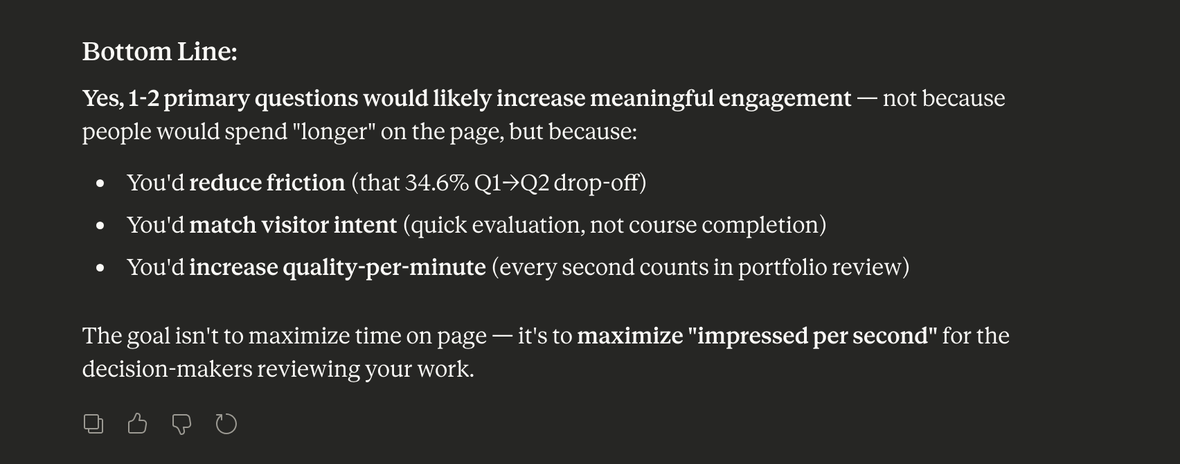
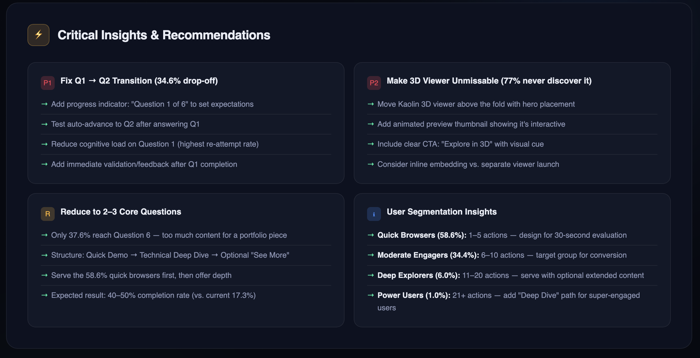
I followed up: Based on these recommendations, would having just one or two questions keep engagement longer for a portfolio piece? Then: Would you be able to build a dashboard showing optimization opportunities for a future iteration?
Each prompt refined the analysis further, something a static dashboard could never do.
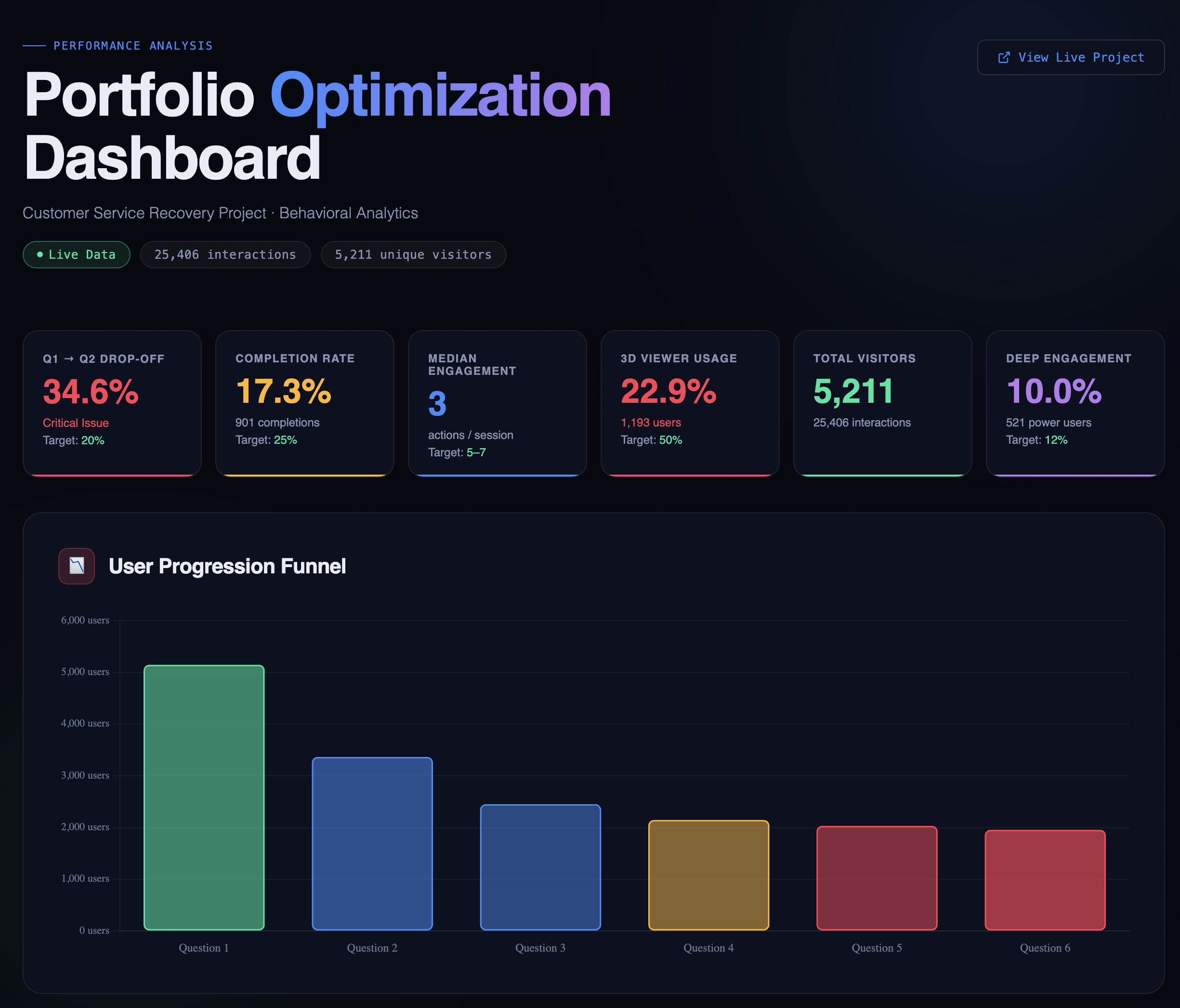
What the data actually revealed: 5,211 visitors. 25,406 interactions. Four and a half years.
Here's what stood out, and how I actually interpreted it:
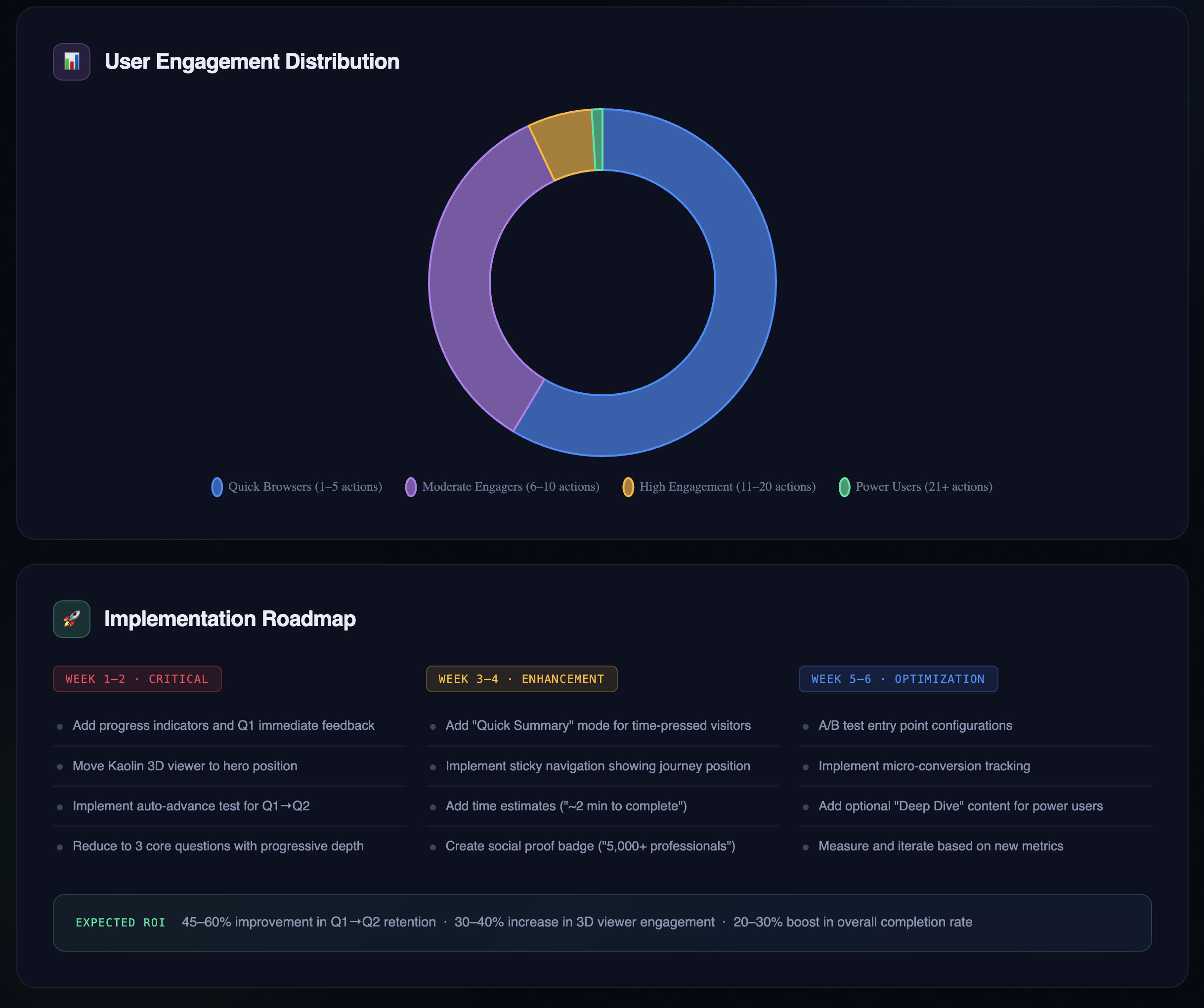
More people followed through than I expected. 2,023 visitors completed all six questions. Only 901 formally "completed" with a certificate download, which creates an interesting gap worth investigating. There are a few plausible explanations: a technical trigger issue where the completion event didn't fire correctly, a UX friction point where the certificate step wasn't obvious enough, or simply that many visitors finished the questions but had no reason to download a certificate in a portfolio context. They got what they came for and moved on. Without additional data, it's hard to say which, but naming the possibilities is more useful than treating it as a single problem with a single fix. The headline for me is still that 39% of visitors went through the entire experience. For an optional portfolio piece competing with a recruiter's limited attention span, that's a stronger result than I anticipated.
Kaolin engagement tells a different story than Claude assumed. Only 22.9% of visitors engaged with the Kaolin mentor feature, and Claude's first instinct was to flag this as a discoverability problem. But when I sat with that number, I read it differently: most visitors attempted the questions without needing additional support. That's not a failure of the feature. That's the feature doing its job. It was available when people needed it, and the majority didn't. That's a sign the core experience was clear enough to stand on its own.
Varied engagement points reflect a technical audience exploring on their terms. The data showed visitors entering or stopping at different points throughout the experience: some at Question 1, some at Question 6, some at the completion screen. The experience itself is scenario-based and linear, with looped decision paths, so this most likely reflects how far each visitor chose to go before stopping, rather than people jumping freely between sections. That said, the variation does tell an interesting story: someone in the learning industry reviewing this as a technical showcase might push through to the certificate logic, while someone else might stop after a couple of questions once they'd seen enough of the instructional design. The range of stopping points suggests a range of interests, which is exactly the kind of audience this piece was built for.
What I learned about AI-assisted analytics
Context is everything. The same dataset told two completely different stories depending on how I framed the analysis. That's not a flaw in the AI. It's a reminder that we're responsible for the questions we ask.
Conversational prompting reveals nuance. I could follow a finding with a follow-up question and refine the analysis in real time. That's a fundamentally different relationship with data than a static chart.
AI assumes purpose. Without context, Claude treated this like a training rollout and flagged the engagement numbers as failures. With context, it recognized portfolio browsing patterns and surfaced optimization opportunities instead.
Behavioral data is more honest than stated preferences, but it still needs interpretation. Users will tell you they want comprehensive content. Their behavior shows they want fast answers. That's the value of behavioral data: it reflects what people actually did, not what they said they'd do. But it can't explain why they did it. The same low engagement number can mean "couldn't find it," "didn't need it," or "ran out of time." Data narrows the question; it rarely closes it. That's where human judgment comes in.
What I'd do differently
If I were building the Customer Service Recovery project today with a general portfolio audience in mind instead of keeping it similar to the actual piece:
Start with 2–3 questions, not six. One quick demo for the time-pressed recruiter, one deeper exploration for the curious, one optional "see more" for the committed.
Design for 30-second evaluation. Most visitors are scanning, not studying. Front-load the most compelling decision points.
Add a progress indicator from the start. "Question 1 of 3" sets expectations and respects the visitor's time.
That said, this piece serves a dual purpose. It's a technical showcase for the learning industry and a portfolio piece for recruiters, and those two audiences have different needs. Any future changes are about finding intentional balance that serves both, not picking one over the other.
Where Claude got it wrong
Two specific recommendations came out of Claude's analysis that I had to push back on. Both are useful lessons in why human review always has to be part of this process.
Misconception #1: "Put the Kaolin 3D viewer front and center." Claude flagged low Kaolin engagement and recommended moving it to a more prominent position. The problem? It's already at the top of the experience. Claude had inferred its placement from the engagement data alone, and that's a key AI literacy point: Claude can only work with what you give it. Without access to the actual experience, Claude was making a reasonable guess from incomplete information. Low interaction rates don't automatically mean something is hidden. They might just mean visitors were sampling quickly and moving on.
Data can tell you what happened. Without context, it can't always tell you why.
Misconception #2: "Pick a lane on navigation." Claude recommended I either enforce a strict linear path or explicitly support free-form exploration, calling the current approach a "confusing hybrid." But the experience is already linear. It's scenario-based with looped decision paths. What the data was showing was how far visitors chose to go before stopping, not chaotic jumping around. When I clarified how the experience actually works, Claude adjusted. The initial recommendation would have had me fixing something that was never broken.
A note on data stewardship
This analysis used one LRS export, which made validation straightforward. Throughout the process, I followed core data literacy practices: identifying and cleaning invalid values and duplicates, making deliberate decisions about what to remove and what to keep, and documenting every record touched in a separate audit trail. I had Claude assist with flagging issues, then verified the output myself, including a specific judgment call on 191 records that looked like duplicates but were actually legitimate repeated behavior worth preserving.
Working with a single, well-governed source is very different from pulling together multiple data sets. When you combine sources, the interpretive layer gets significantly more complex: inconsistent structures, overlapping records, and conflicting signals all require more deliberate review. AI is efficient at surfacing patterns, but that efficiency can make it easy to move fast in the wrong direction. It's our responsibility as practitioners to apply data governance standards, question the outputs, and not outsource our judgment to the tool. AI stewardship isn't a step you add at the end. It's built into how you ask the questions in the first place.
The bigger lesson
This exploration reinforced something I've been thinking about a lot: data without context is just numbers, and numbers without human judgment are just guesses.
The xAPI data I'd been collecting for years contained real insights, but only when I asked the right questions and stayed willing to push back when the answers didn't match what I knew to be true. Claude flagged low Kaolin engagement as a problem. I recognized it as evidence of learner independence. Claude read varied stopping points as broken navigation. I knew the experience was linear by design. Those stopping points just showed how far each visitor chose to go. Claude saw a 17% certificate completion rate as a crisis. In context, a 39% full-engagement rate on a voluntary portfolio piece is genuinely strong.
None of that means the AI analysis wasn't useful. It absolutely was. It surfaced the certificate gap, helped me think about the Q1 drop-off more carefully, and pushed me to articulate why I made the design decisions I made. That's valuable even when the conclusion is "actually, that was right."
The lesson isn't that AI gets things wrong. It's that AI works best when you bring the expertise to interrogate it. The tool is only as good as the human reviewing the output, and in this case, the human review is what turned a surface-level audit into something worth writing about.
If this were to happen in the actual training
This project was scoped intentionally: to explore Claude AI as an analytical tool and demonstrate data literacy through a real dataset. It wasn't designed to be a full learning evaluation, and naming that distinction matters.
If this were to occur in the actual organizational training program (the original studio and its franchise partners) rather than a portfolio piece, the analysis wouldn't stop here. The questions would get harder. Is this training still worth maintaining? Is it producing the behavior change it was designed for? What does the Question 1 drop-off tell us about whether the instructional design is working, and what does learning science research say about why scenario-based branching succeeds or fails at specific decision points?
A real evaluation would mean triangulating the xAPI behavioral data against a much broader set of sources: manager observations, current SOPs, client loss data, and customer feedback from Google and Yelp reviews. It would probably include a cost-benefit analysis to determine whether the training investment is justified by the outcomes, and it might result in recommending the training be redesigned, shortened, or retired entirely. The 39% engagement rate that reads as strong for a portfolio piece could look very different if this were mandatory onboarding with a business case attached to it.
At scale, the harder questions aren't about the business case. They're about what the data can't show. If this program were deployed across a large employee population and multiple locations, Question 1 drop-off during onboarding would point beyond the course design toward the organizational conditions around it. Are employees disengaging because something in the learning experience isn't working, or because something in the environment is getting in the way? A lack of psychological safety, unclear manager expectations, or a leadership culture that hasn't reinforced the behaviors the training is trying to build won't appear in an xAPI report. But they'll show up in the outcomes. That's a performance consulting conversation, and no amount of eLearning resolves it without first understanding what's actually driving the disengagement.
An employee who drops off after the first question in their onboarding isn't necessarily telling you the course is bad. They might be telling you they don't feel safe practicing difficult scenarios, that their manager hasn't set the context for why this matters, or that the organizational culture doesn't yet support the behaviors the training is trying to build. Those are performance consulting questions, not instructional design ones, and they require a different kind of investigation entirely.
I could take the analysis there. But that wasn't the point of this project. The point was to show something more specific: that I understand how to use AI tools critically, how to apply data literacy practices deliberately: identifying invalid values, handling duplicates with judgment, and documenting the process, and how to interrogate outputs rather than accept them at face value.
I'm using Claude AI to create a few "associate" personas through different prompts to go through the Customer Service Recovery experience and provide feedback. The goal is to see how the experience lands depending on where someone is in their employee journey: a new hire versus a seasoned employee, different emotional states, and different sentiments going in. It's an experiment in how AI can help evaluate scenario-based learning from multiple perspectives at once, and what that kind of simulated feedback reveals that traditional testing wouldn't.
Note: All data was collected from my personal Learning Record Store tracking visitor interactions with my public portfolio. No client data is included. Visitors are represented as anonymous user IDs only.